PIAZZA

Piazza is an education technology company founded in 2009, whose flagship Q&A web application is central to teaching in STEM and Computer Science departments across the US and the world.

In 2014, we built and released ground-up redesigned and rewritten versions of Piazza’s Android and iOS apps. User-centered design was key: focusing on the needs of Q&A users who are checking in on their classes on the go.
The first order of business: listening to
our users.

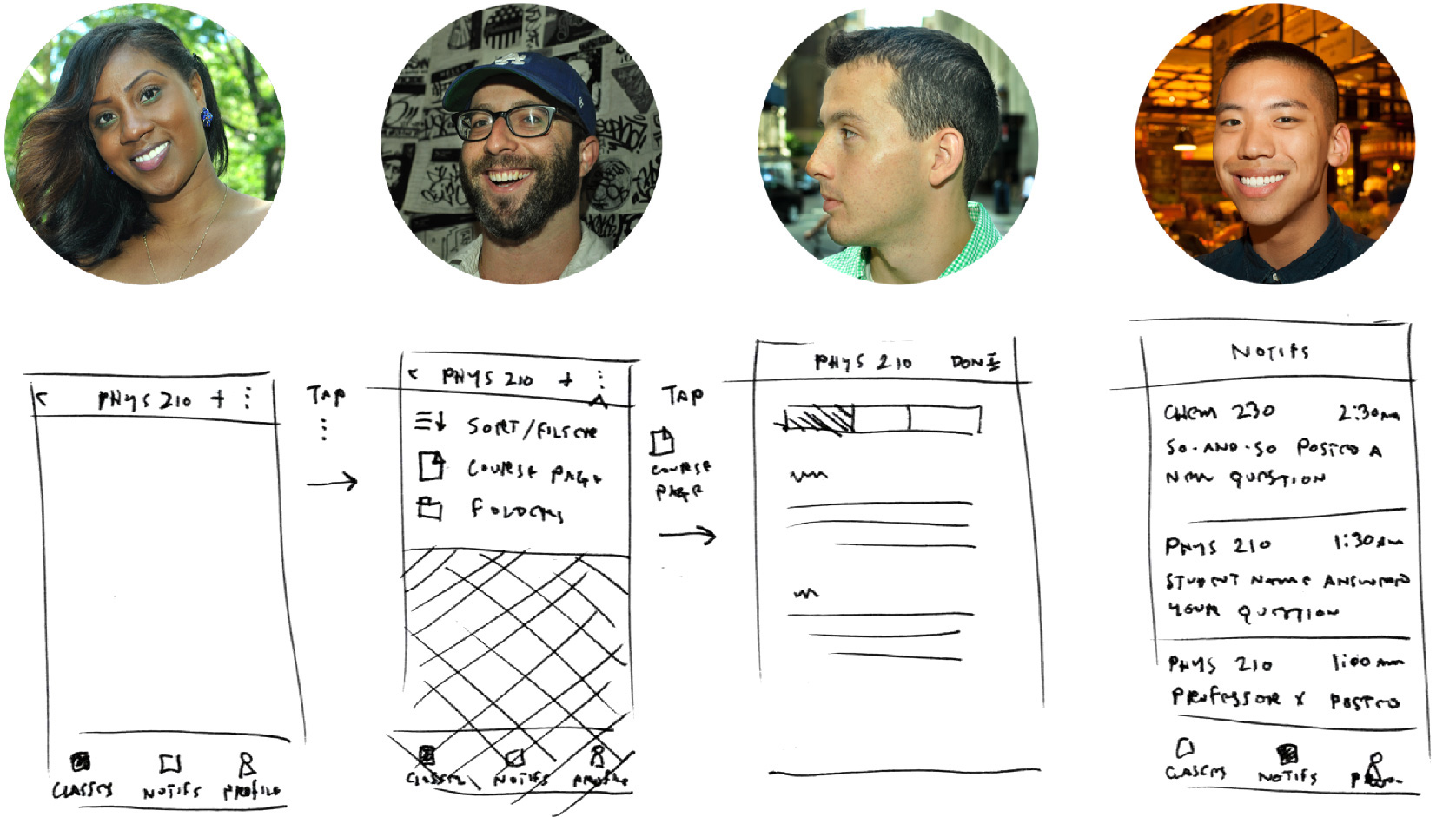
The process began with onsite interviews with students, TAs, and professors in STEM and Computer Science departments at Stanford University and San Jose State University. Finding out how users’ mobile devices are intertwined with not just their learning but their lives pointed the way. Armed with new understanding about the needs of users across each segment, out came the sketchbook. Staying loose and lo-fi allowed for extensive iteration on core interactions.

Flow.
Prototype.
Test.

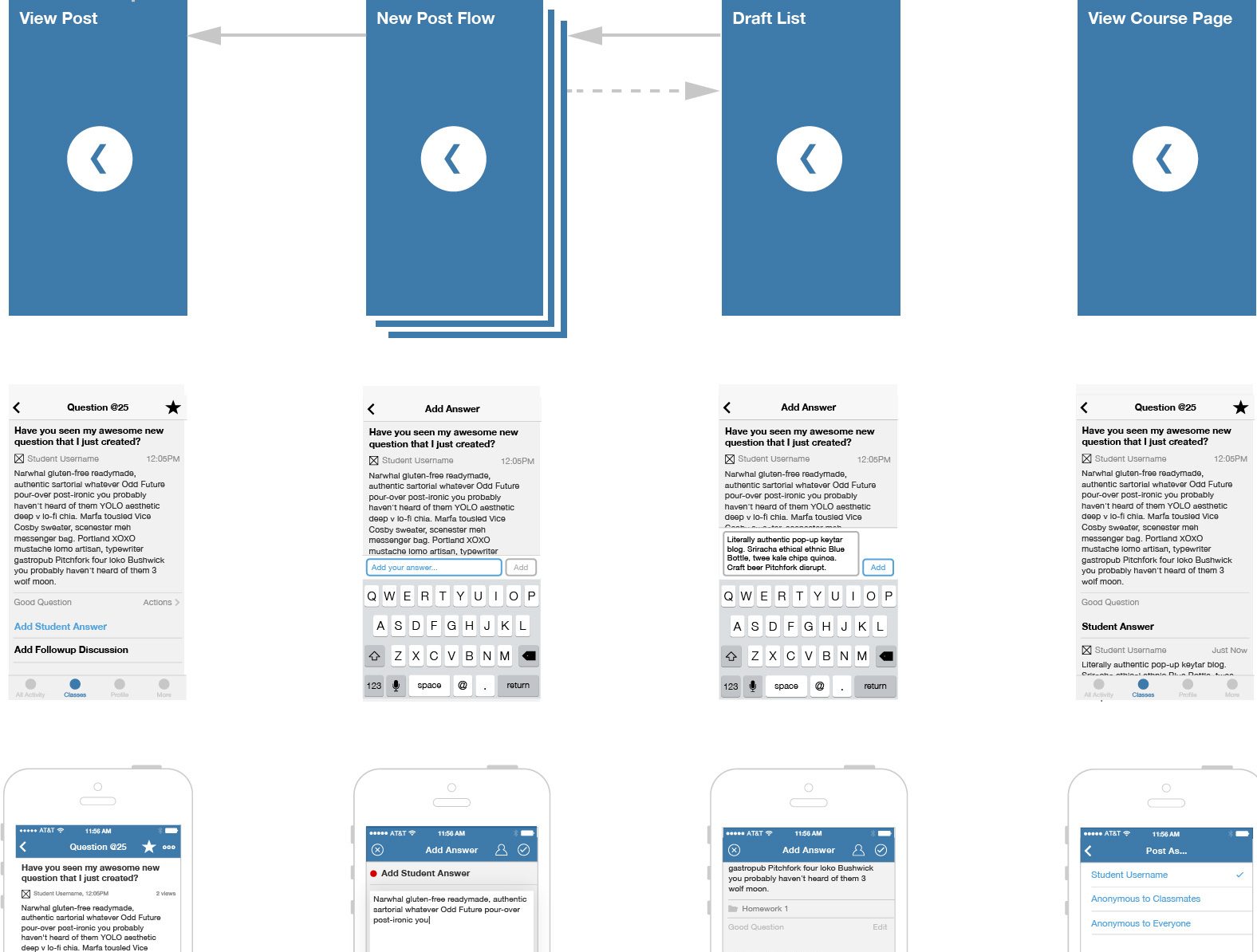
Moving from sketches to information architecture and task diagrams delivered artifacts that pointed towards optimization for both performance and UX. Validating choices made at this stage required not just solid wireframes, but solid prototypes as well. Using tools like Flinto and Framer.js allowed on-device prototyping with native transitions with screens of all levels of fidelity, allowing repeated usability testing.

The Add Answer flow is the core of Piazza’s app.

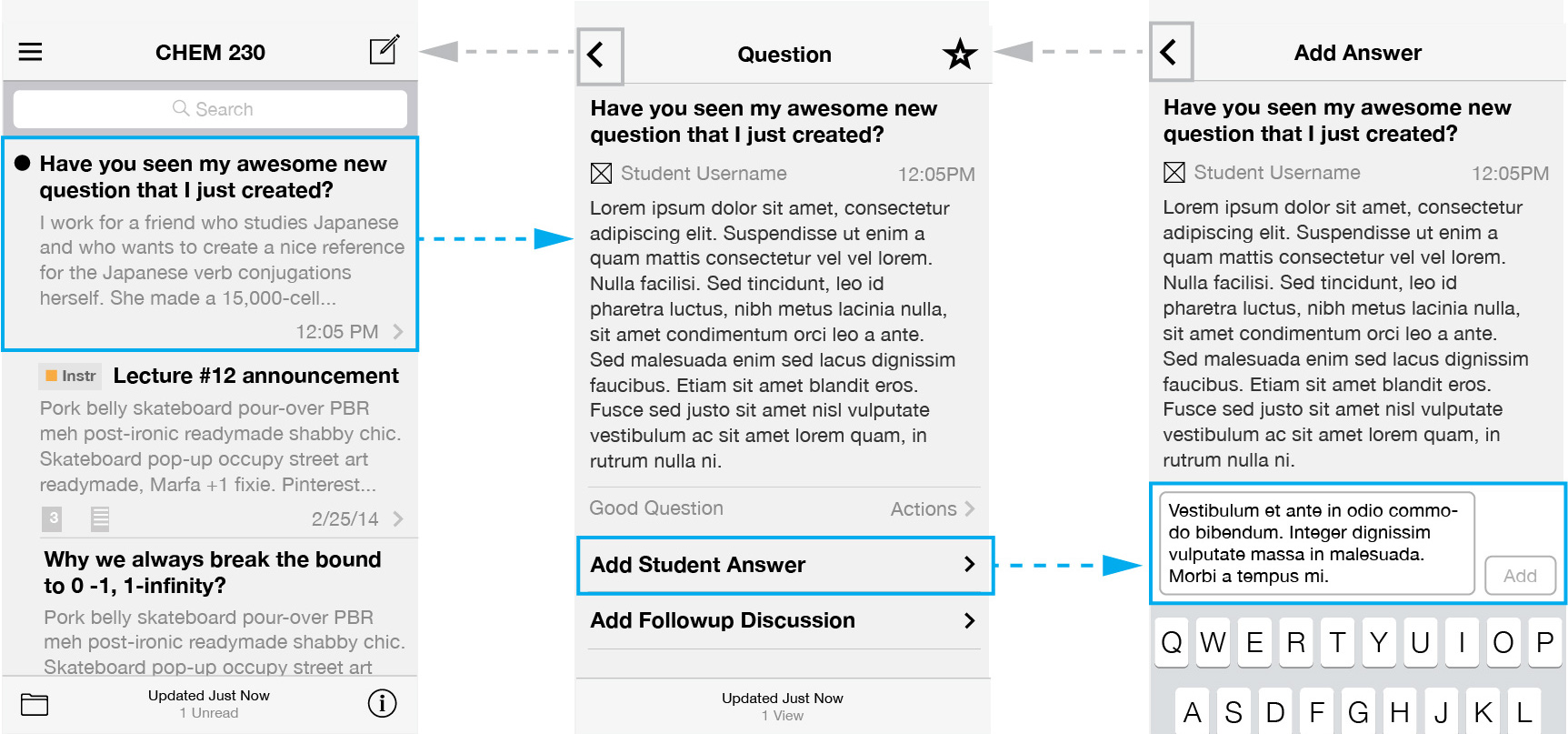
The Add Answer flow is one of the most important in the Q&A app. A common thread in user interviews was the complaint that on mobile, unlike desktop, users weren’t able to see the question while composing an answer, since the composer was a modal laid over the question view. A first pass used a “keyboard hugger” text field, akin to that used in Messages. This was wireframed and then converted to a Flinto prototype for user testing in order to vet the design.

Iteration on the Add Answer flow was driven by usability testing

After a few rounds of exploration, a new solution emerged: an inline textarea similar to a web form. Further testing proved that the inline solution was easier for users to understand and was preferred for its similarity to the Piazza web app.

Sharing how we
moved the needle

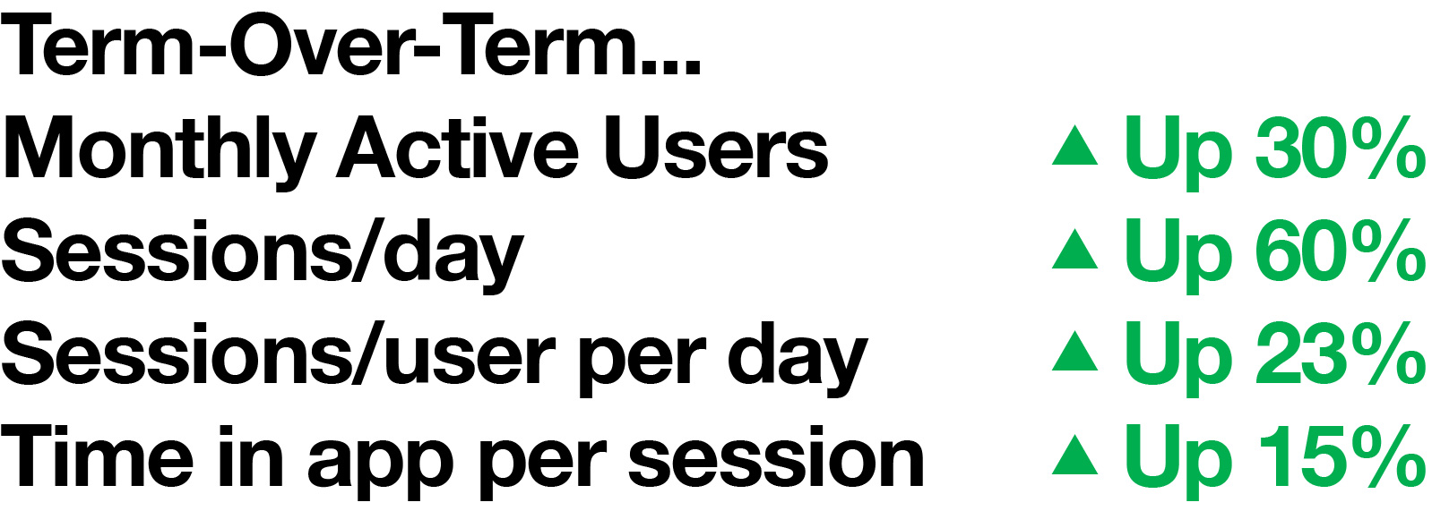
With Fabric.io’s Crashlytics package in place for both Android and iOS for over a year, Piazza was well-positioned to evaluate the success of the new builds. The new releases for Android and iOS hit their respective stores between school semesters, giving a great opportunity to measure changes in growth and engagement between the old apps and the new. One month into the Spring semester, the numbers spoke for themselves. In a company-wide shareout, we showed a 23% growth in sessions per user per day and a 15% jump in time spent per session, speaking clearly to the stickiness of the new designs.

Because we had done thorough qualitative work and understood our users well, we could deduce what numbers would tell us whether we were hitting the mark. Learning how to use metrics, in tandem with qualitative research, to measure the success of design choices was a big takeaway from this project.


← Back to Work