HOVER

At HOVER, I worked alongside an awesome senior engineer to take a homegrown, side-project design system with a few components in Figma and corresponding ones for React to a robust set of components and patterns that designers and front-end engineers could use to build almost any UI the product required. This was an opportunity to do visual and interaction design, act as a product manager, write SCSS, MDX and JSX, and even a bit of TypeScript, all while keeping UX in mind; UX for a new set of customers: our designers and engineers.

Being empowered to make strategic decisions and UI choices for this design system was an opportunity to build for designers and engineers.

Building out a set of components that could build 80+% of any UI our feature teams could envision was table stakes, but even the most robust system only has meaning when it's in use. Driving adoption by understanding what our design and engineering users needed and how we might streamline their workflows and then prioritizing and delivering “features” that would fill those needs was the go-to strategy.

On the design side, I set up regular 1:1s with each IC designer, to understand their pain points. One common struggle was around finding and using icons; we used an open-source library with hundreds to choose from, so digging around in Figma’s asset pane, even with search at hand, added a bit of overhead.

Creating one-sheets saved designers the trouble of wading through hundreds of icons and fit with their existing workflows.

I surveyed the team and built a list of the most commonly-used icons and created a “one-sheet,” a Common Icons component that folks can pull in, or use in starter template files they might make for themselves. It has nested icon components inside it, set to the default size we ship in both Figma and code, so designers can easily copy and use these in their designs. Designers were excited about this even immediately after release.

Developer experience is UX!. Ensuring engineers can easily find what they needed and understand how to use it makes for smoother implementation.

On the code side, we put a focus on developer experience, with strong documentation for getting started, contributing, and choosing and using components. Our icon documentation, for example, makes it easy for developers to find what they need and implement quickly, with names and APIs that match Figma component attributes.

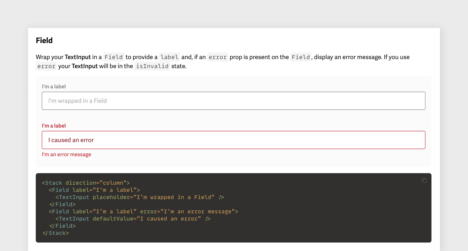
Component documentation includes live-code examples that anyone can use.
[Watch a short video showing it in action]

We even set up live code examples with each component, so engineers (and anyone else!) can see in real time how the API works. This kind of attention to the details of Blueprint’s customer experience allowed us to arrive at a full 1.0 having landed our work across nearly all of our codebases: UI on the web, our internal admin tools, and on mobile.

Building the system and driving adoption with a customer-obsessed “product within a product” approach, seeing designers and engineers as our customers and taking an iterative, research-driven approach to creating reusable patterns and components yielded success that continues to play a part in HOVER’s product development today.


← Back to Work