COURSERA

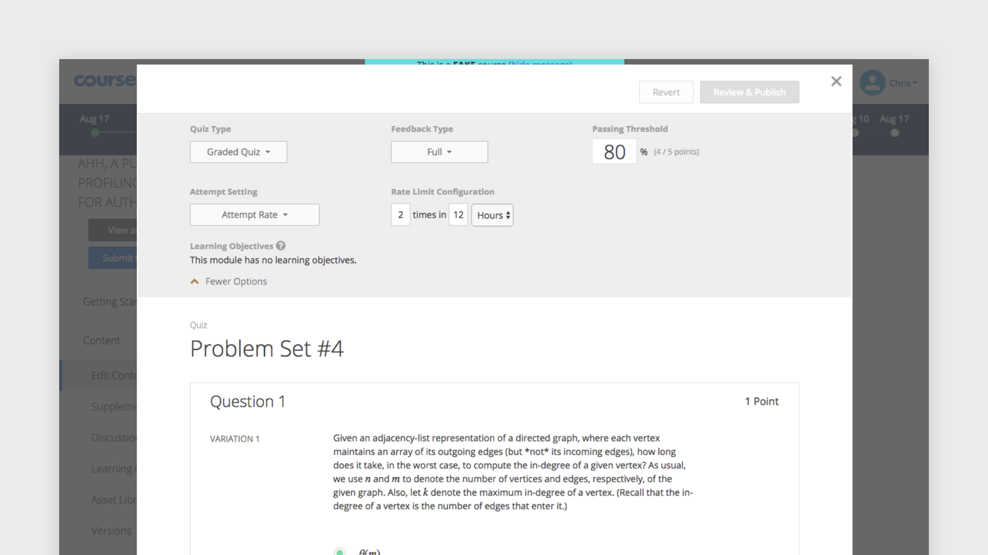
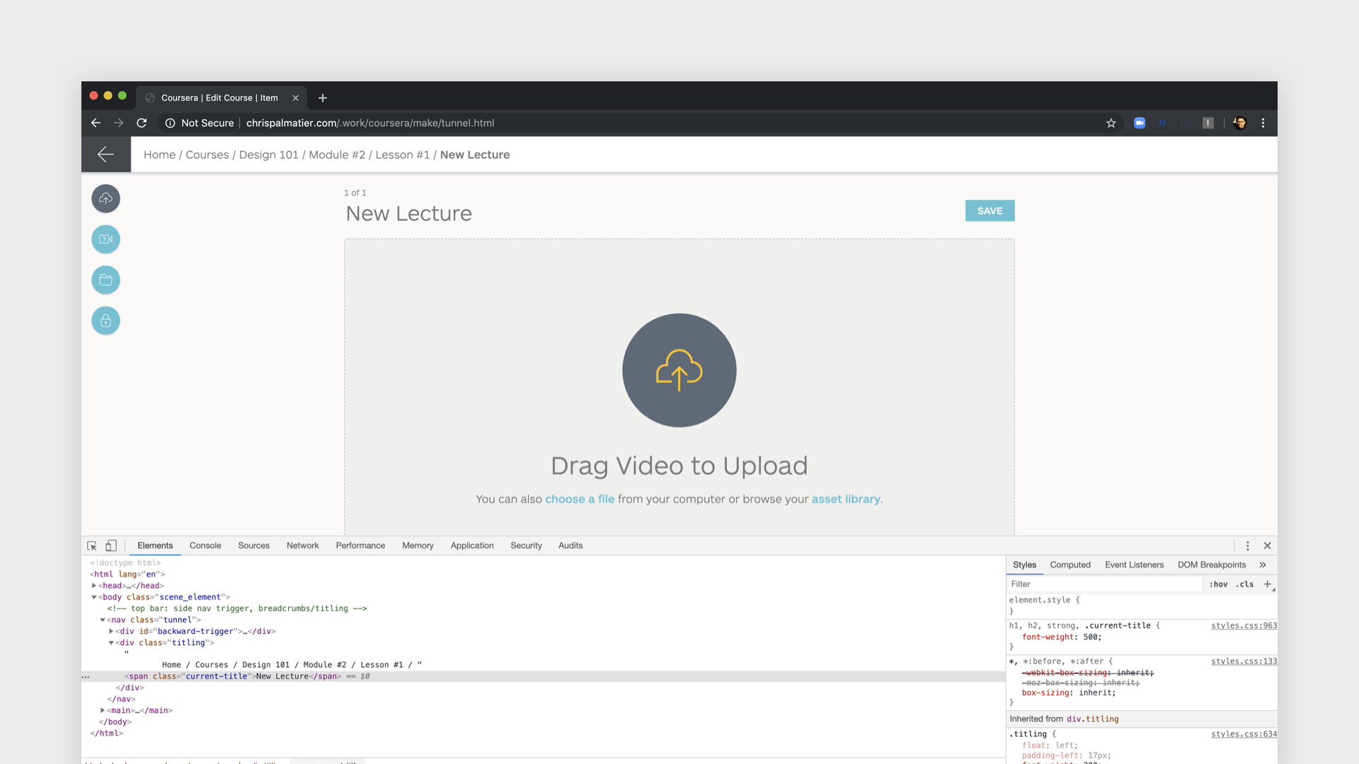
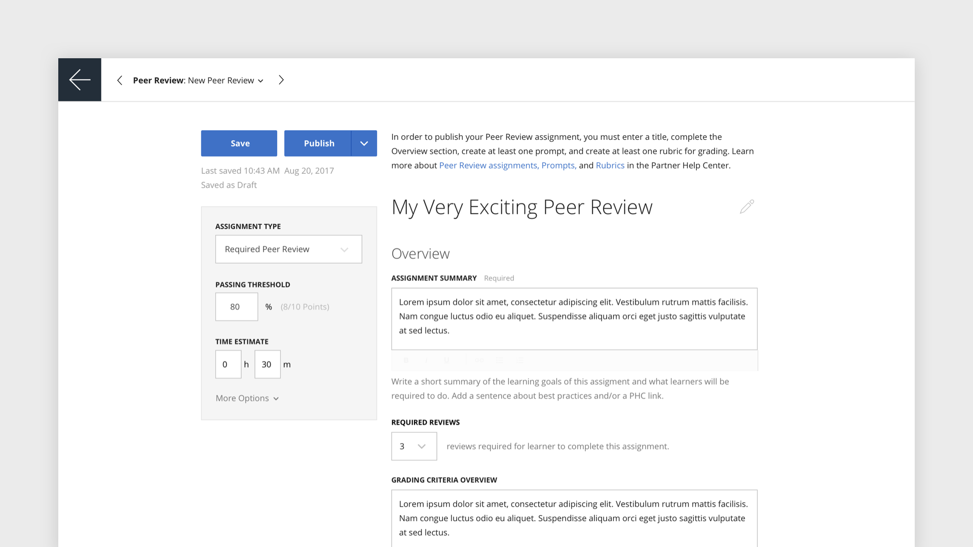
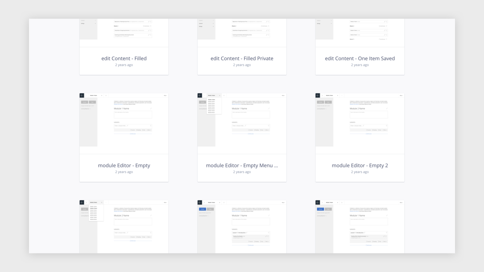
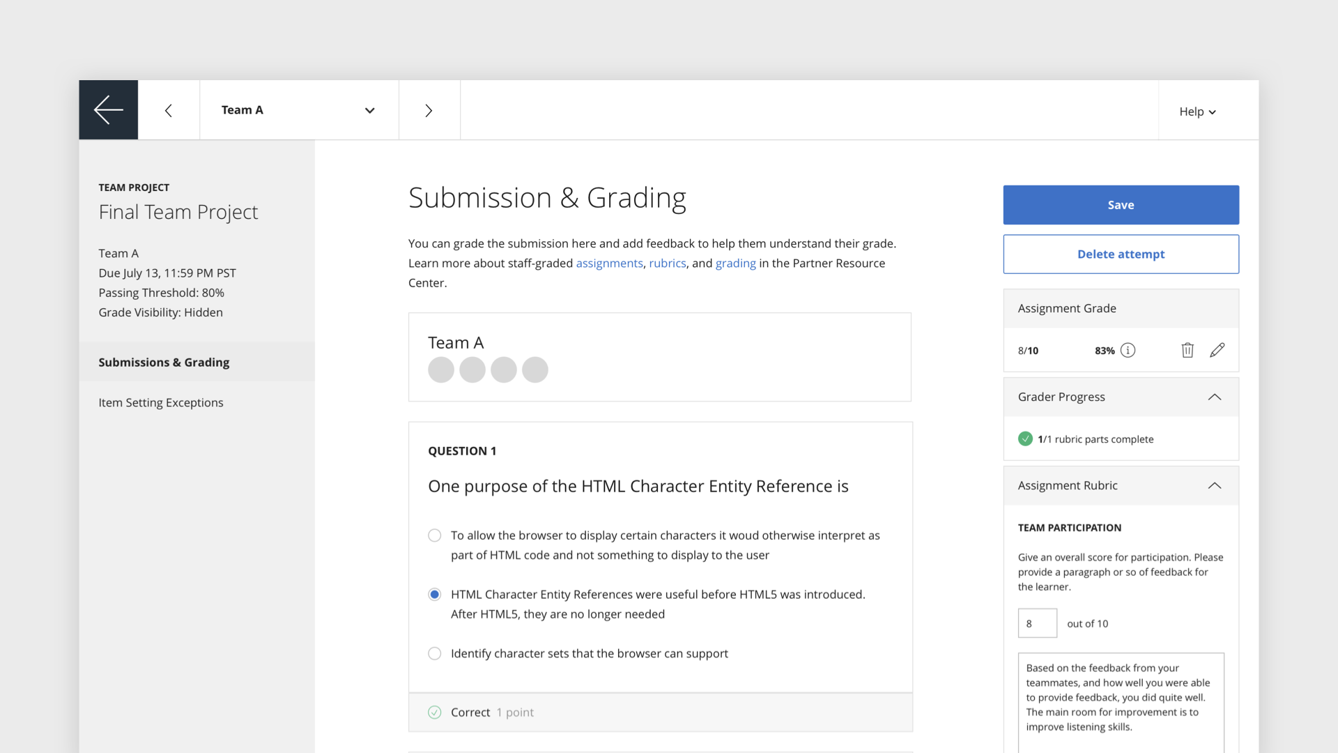
In 2017, we realized that our content authoring system had a couple of problems. First, we wanted to make updates to the UI for creating individual course items—readings, video lectures, quizzes, and so on. As needs specific to degree courses grew, the existing design became unsustainable. Cramming in more and more settings and capabilities resulted in a confusing UI.

By 2017, the course item authoring UI was becoming strained.

Second, we didn’t have a reusable pattern for moving the user back and forth between a list of items and their respective detail views that was abstracted enough to be reusable, able to meet the particular needs of any specific use case, not just item authoring.

For authoring, manual grading, and similar cases, users wanted to move smoothly from detail to detail.

We were in regular contact with teams at our university partners, so understanding what users needed in both the course authoring tooling and in other similar list-and-details cases was easy—just talk to the folks you’re building with. After a few user interviews, the need came into focus. Users needed the option to work with detail views in sequence.

So, we were able to generate a clear problem statement: How might we create a consistent list-and-details pattern that maximizes screen real estate and ease of horizontal navigation so that users can complete a variety of authoring and administrative tasks in a focused, frictionless way?

From sketches to prototypes to high-fidelity mockups, we took an iterative approach.

Then came time for loops of iteration versus validation and critique. A combination of rough sketching and ideas generated during one of Coursera’s hack weeks yielded results worth bringing to higher fidelity. A key part of bringing focus to the design was using the top bar to allow navigation horizontally and back up to the parent list, while hiding the global navigation to ensure the user stays focused on the details of their task.

Several tasks in one prototype helped us rigorously test
our new pattern.

We took advantage of Coursera’s Partners Conference to bring the new pattern to a variety of potential users—faculty, instructional designers, and other course staff. We conducted thorough usability tests that proved that the pattern was intuitive: users never got stuck while completing the tasks in our script.

From handoff to guidelines to wide use.
[2019 grading screen designed by Madeline Frechette]

Once we had validated the designs, I shared the final spec with the front-end engineer via InVision Inspect and paired with him to fine tune every part of the pattern. But, the work didn’t stop when we shipped the solution for this initial use case.

I developed guidelines for using the pattern and presented these to the rest of the designers working on the Partner design team. Together, we evolved the pattern and deployed it across the product in both refinements to existing flows and in new features as they came up. Integrating Tunnel Vision into our work, we were able to achieve consistent, usable list-and-details UI across the product.


← Back to Work