UC BERKELEY

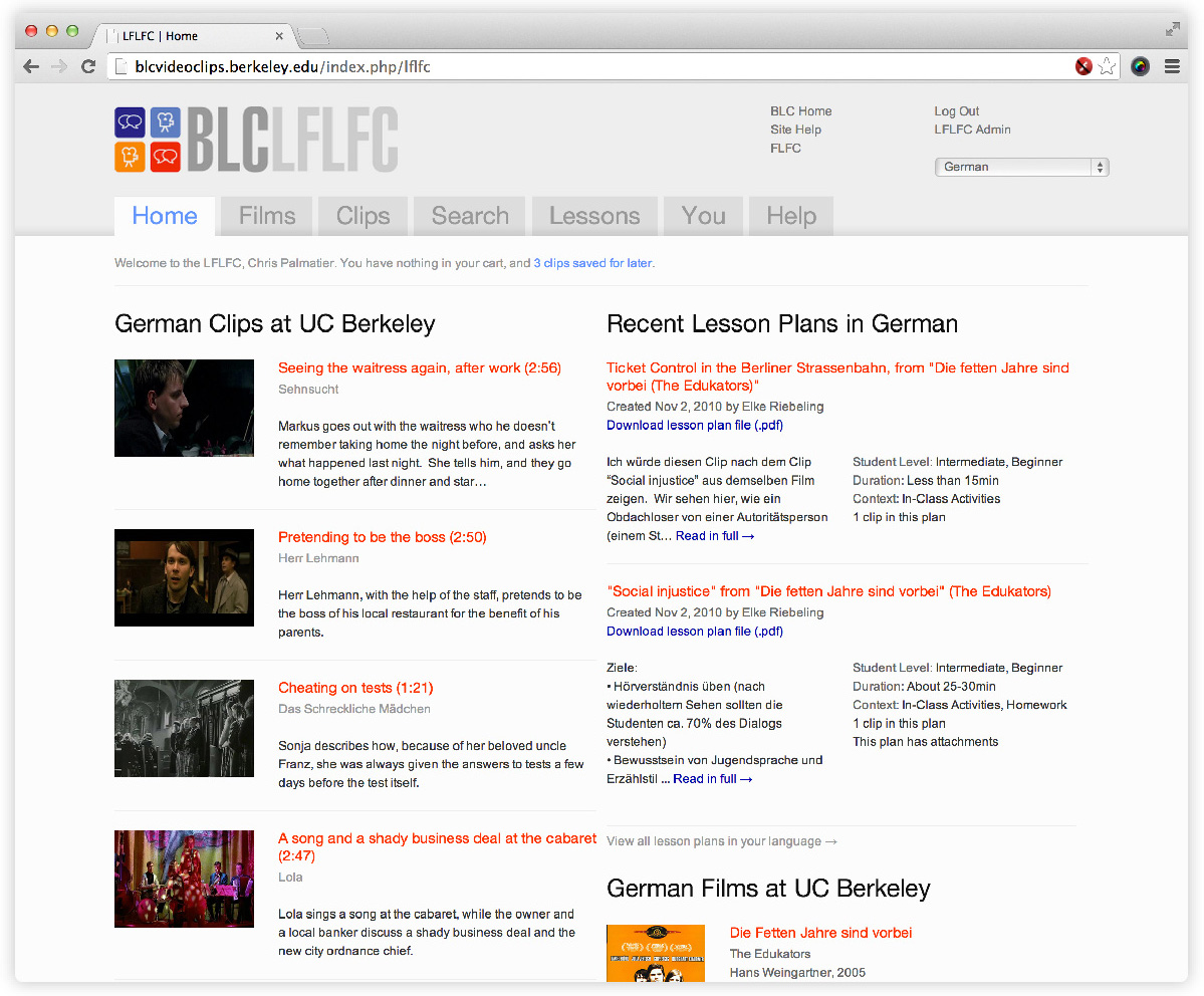
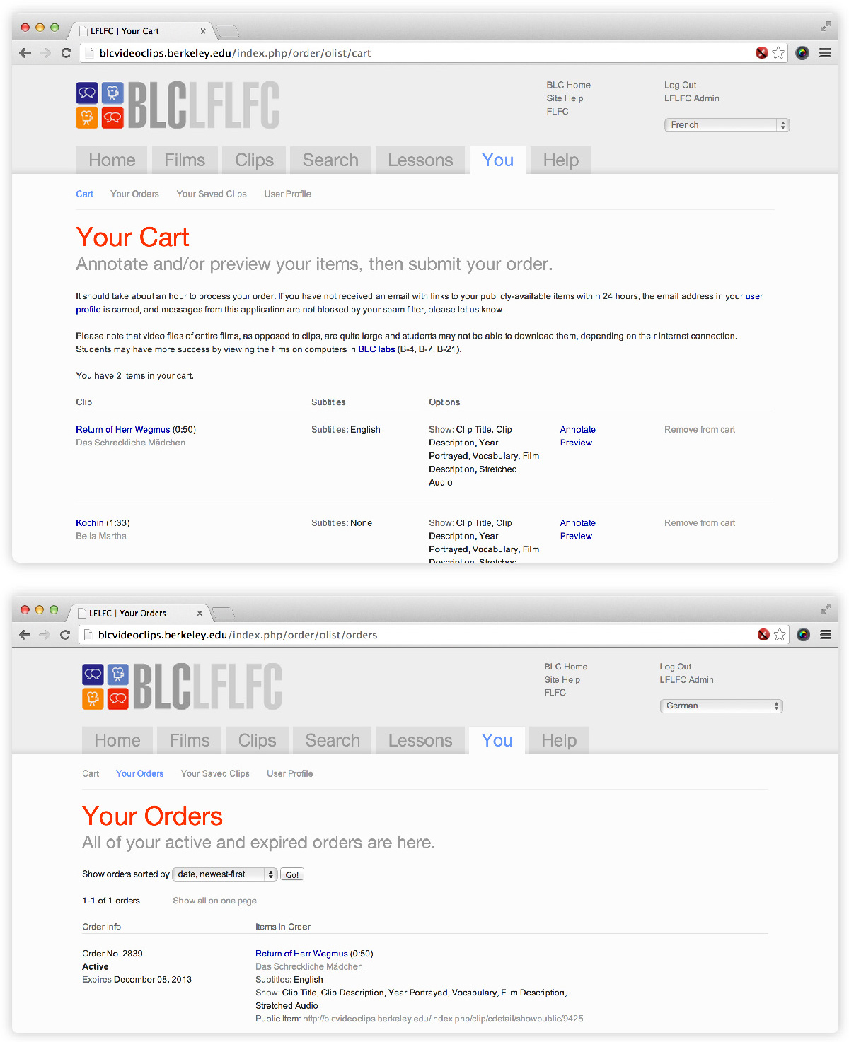
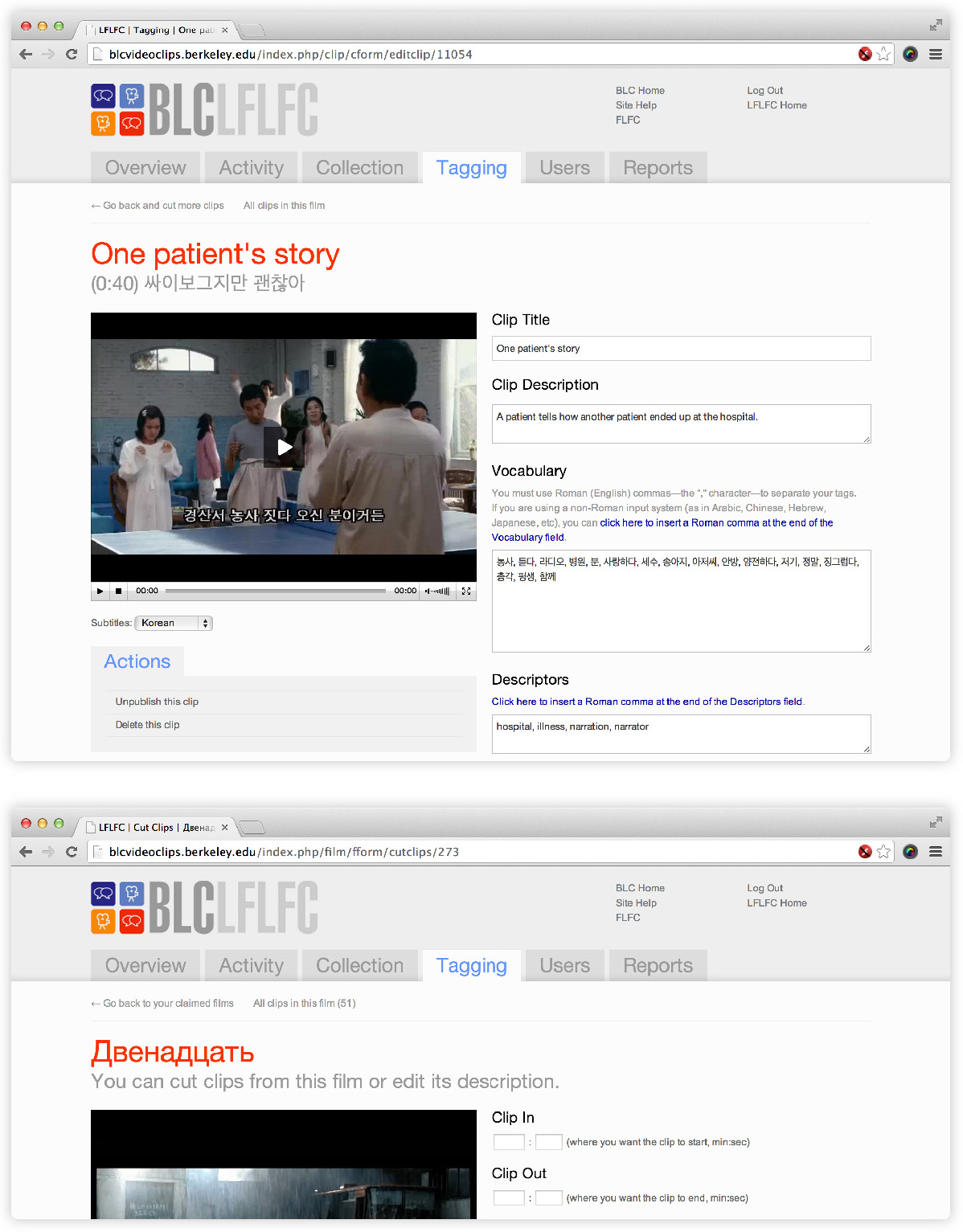
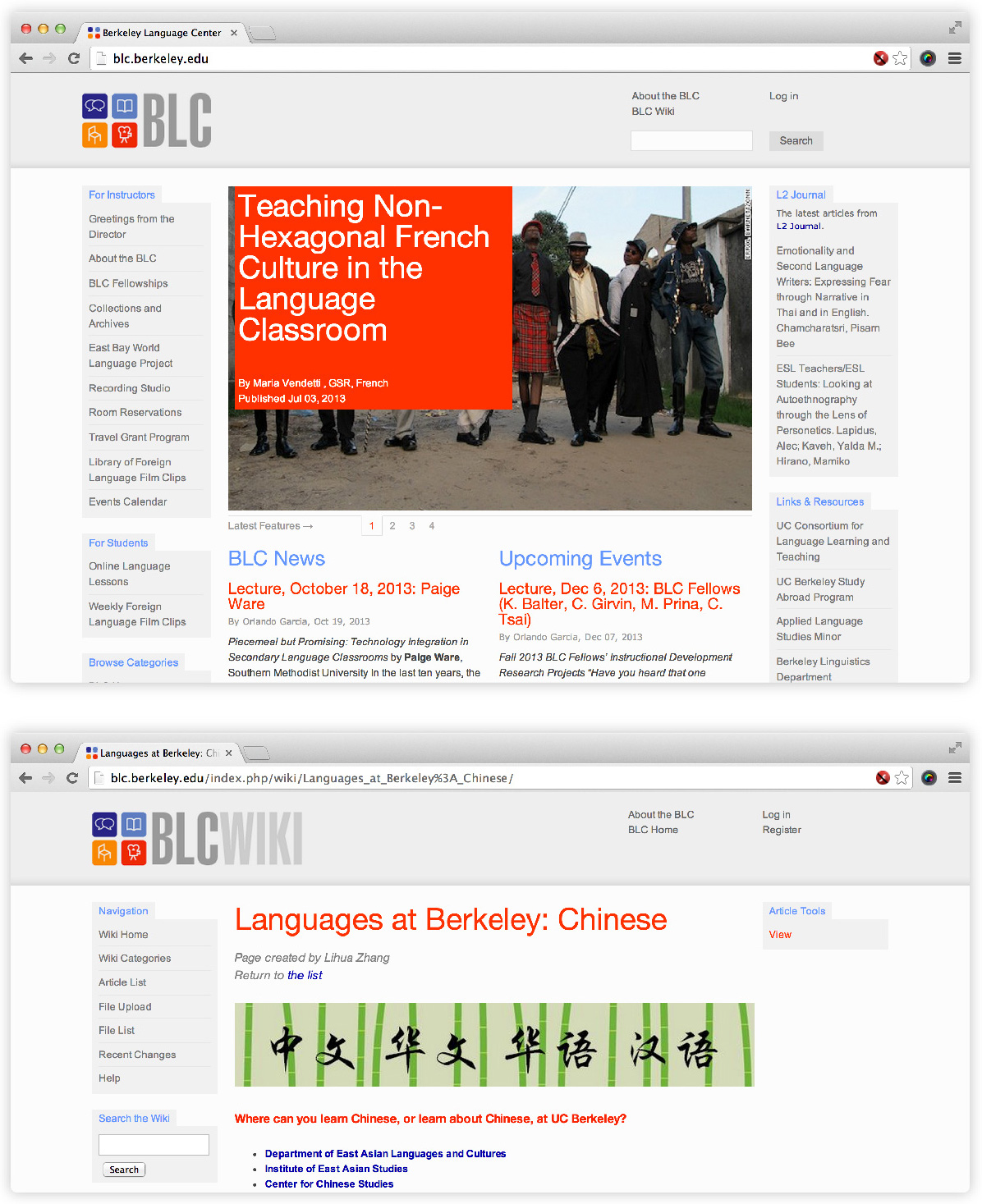
My first digital product design and development gig was with Cal’s Berkeley Language Center (BLC). With BLC Associate Director Mark Kaiser as product manager, I was both designer and developer—with a dash of sysadmin—for the department. Our main focus was building, iterating on, and maintaining a large scale video tagging and distribution system. Our tech stack was based on MySQL, php5, prototype.js, and blueprint.css, and my design tools of choice were Adobe Illustrator and CSSEdit—those were the days!

The Library of Foreign Language Film Clips in 2009

In 2006, the BLC launched the Library of Foreign Language Film Clips (now known as Lumiere). Then and now, it’s a collection of over 10,000 film clips in over 50 languages, available to language instructors and students at more than 60 colleges and universities in 3 countries. These clips are cut and tagged by native speakers, using the app’s “back office,” powered by ffmpeg and a lot of RAID space.

What’s the model? Even in the early 2000s, users understood e-commerce.

Once we had the broad idea—distribute film clips for use by language instructors—we tackled our first problem: finding the right product metaphor to help non-tech-savvy language instructors step into a large, structured database of film clips.

Extensive conversations with prospective users told us that all instructors understood an Amazon-like e-commerce model. In the basic UX we launched with, instructors order and configure their clips, which are assigned public URLs that, for copyright reasons, expire after a set duration. All orders are saved and can be reproduced semester after semester.

Once we had the core features dialed in, we went on to launch a Lesson Plans feature: groups of clips can be linked together and augmented with additional pedagogical materials, and then shared with instructors at any school in the system.

UI for everyone: using the same set of patterns across the app kept things simple for developer and user alike.

From the beginning, the app’s UI relied on simple shapes and text labels rather than icons for meaning. LFLFC users come from a variety of cultural and linguistic backgrounds, with a single common thread: the understanding of simple English. Continual user testing focused on improving copy throughout the site ensured an accessible product for everyone.

Systematized design and front-end code made working across products easier while delivering a seamless UX for users.

The LFLFC existed within a clearly articulated design program, using consistent typographic, color,and layout solutions across the BLC’s entire web ecosystem. We wanted to present a seamless experience to students and staff who used any number of BLC products and services. For my part, learning how to think in systems, both in code and in design, was a great foundation for work to come.


← Back to Work